The ipyrad.analysis module: PCA
As part of the ipyrad.analysis toolkit we’ve created convenience functions for
easily performing exploratory principal component analysis (PCA) on your data.
PCA is a very standard dimension-reduction technique that is often used to get a
general sense of how samples are related to one another. PCA has the advantage
over STRUCTURE type analyses in that it is very fast. Similar to STRUCTURE,
PCA can be used to produce simple and intuitive plots that can be used to guide
downstream analysis. These are three very nice papers that talk about the
application and interpretation of PCA in the context of population genetics:
- Reich et al (2008) Principal component analysis of genetic data
- Novembre & Stephens (2008) Interpreting principal component analyses of spatial population genetic variation
- McVean (2009) A genealogical interpretation of principal components analysis
A note on Jupyter/IPython
Jupyter notebooks are primarily a way to generate reproducible scientific analysis workflows in python, R or Julia. ipyrad analysis tools are best run inside Jupyter notebooks, as the analysis can be monitored and tweaked and provides a self-documenting workflow.
The rest of the materials in this part of the workshop assume you are running all code in cells of a jupyter notebook that is running inside binder.
PCA analyses
- Simple PCA from a VCF file
- Coloring by population assignment
- Specifying which PCs to plot
- Multi-panel PCA
- More to explore
Create a new notebook for the PCA
Return to your jupyter notebook dashboard, navigate to your ipyrad-workshop
directory, and create a new notebook by choosing New->Python 3, in the
upper right hand corner.
Import Python libraries
The import keyword directs python to load a module into the currently running
context. This is very similar to the library() function in R. We begin by
importing ipyrad, as well as the analysis module. Copy the code below into a
notebook cell and click run.
import ipyrad.analysis as ipa ## ipyrad analysis toolkit
Quick guide (tl;dr)
The following cell shows the quickest way to results using the simulated data we just assembled. Complete explanation of all of the features and options of the PCA module are documented here, but given the limited time, we will only be covering this very briefly.
vcffile = "/home/jovyan/ipyrad-workshop/rad_outfiles/rad.vcf"
## Create the pca object
pca = ipa.pca(vcffile)
## Run the PCA analysis
pca.run()
## Bam!
pca.draw()
Note The
#at the beginning of a line indicates to python that this is a comment, so it doesn’t try to run this line. This is a very handy thing if you want to add or remove lines of code from an analysis without deleting them. Simply comment them out with the#!
Full guide
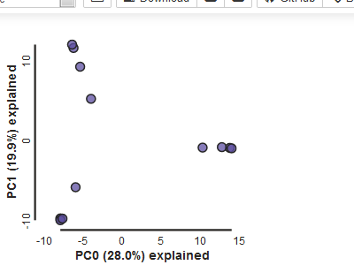
Simple PCA from vcf file
In the most common use, you’ll want to plot the first two PCs (here called axis 0 and axis 1), then inspect the output, remove any obvious outliers, and then redo the PCA. It’s often desirable to import a vcf file directly rather than to use the ipyrad assembly, so here we’ll demonstrate this with Anolis data from Prates et al 2016.
## Use wget to fetch the vcf from the RADCamp website
!wget https://radcamp.github.io/Marseille2020/Prates_et_al_2016_example_data/anolis.vcf
vcffile = "anolis.vcf"
pca = ipa.pca(vcffile)
Note: Here we use the anolis vcf generated with ipyrad, but the
ipyrad.analysis.pcamodule can read in from any vcf file, so it’s possible to quickly generate PCA plots for any vcf from any dataset.
pca.run()
pca.draw()
Population assignment for sample colors
For the interpretation of the plot it can be very useful to know which points
represent which sample, or which population. You can create a dictionary
including this information. The format of the dictionary should have
populations as keys and lists of samples as values. Sample names need
to be identical to the names in the vcf file, which we can verify with the
samples_vcforder property of the PCA object.
Here we create a python ‘dictionary’, which is a key/value pair data structure. The keys are the population names, and the values are the lists of samples that belong to those populations. You can copy and paste this into a new cell in your notebook.
imap = {
     "South":['punc_IBSPCRIB0361', 'punc_MTR05978','punc_MTR21545','punc_JFT773',
             'punc_MTR17744', 'punc_MTR34414', 'punc_MTRX1478', 'punc_MTRX1468'],
     "North":['punc_ICST764', 'punc_MUFAL9635']
}
Now create the pca object with the vcf file again, this time passing
in the pops_dict as the second argument, and plot the new figure. We can
also easily add a title to our PCA plots with the label= argument.
pca = ipa.pca(vcffile, imap=imap)
pca.run()
pca.draw(label="Anolis PCA")
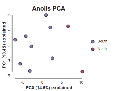
This is just much nicer looking now, and it’s also much more straightforward to interpret.
Question: Why does the figure look a little different every time you call run() and draw()?
Writing the figure to a file
Here we introduce another nice feature of the pca.plot() function, which is
the outfile argument. This argument will cause the plot function to write
the figure to a file in either png, pdf, or svg format (determined by
the file extension you ask for).
pca.draw(label="Anolis PCA", outfile="Anolis_pca.pdf")
Note: Spaces in filenames are BAD. It’s good practice, as we demonstrate here, to always substitute underscores (
_) for spaces in filenames.
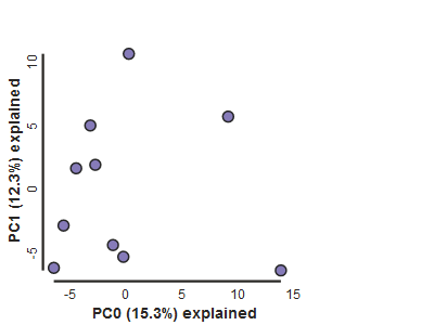
More advanced features of the PCA analysis module which you may explore later
Looking at PCs other than 1 & 2
PCs 0 and 1 by definition explain the most variation in the data, but sometimes PCs further down the chain can also be useful and informative. The plot function makes it simple to ask for PCs directly.
## Lets reload the full dataset so we have all the samples
pca = ipa.pca(vcffile, imap=imap)
pca.run()
pca.draw(2,3)
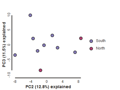
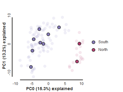
Subsampling with replication
The exact plots may look a bit different because of random sampling of one SNP per locus. However, we can also run replications in the subsampling. The replicate results are drawn with a lower opacity and the centroid of all the points for each sample is plotted in high opacity. Note that the Anolis dataset we use here is severly downsampled, which may lead to quite a lot of noise.
## Lets reload the full dataset so we have all the samples
pca = ipa.pca(vcffile, imap=imap)
pca.run(nreplicates=10)
pca.draw()
Fine grained color control
Very fine control over exact colors for each population can be manipulated
with the colors argument for pca.draw(). colors takes a list which should
be the same length as the imap dictionary. Colors can be specified either as
CSS color names, or as toyplot.color.rgb values.
import toyplot

imap = {"p1":['1A_0', '1B_0', '1C_0', '1D_0'], "p2":['2E_0', '2F_0', '2G_0', '2H_0'],
        "p3":['3I_0', '3J_0', '3K_0', '3L_0']}

pca = ipa.pca(data, imap=imap)
pca.run()
pca.draw(colors=[toyplot.color.rgb(1, 0, 0), "maroon", "red"])
More to explore
The ipyrad.analysis.pca module has many more features that we just don’t have time to go over, but you might be interested in checking them out later: